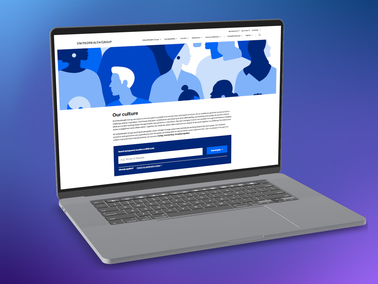
A navigation audit and UX writing overhaul that made UnitedHealth Group's careers site easier to find your way around, for job seekers who'd never seen an org chart and shouldn't have to.
View the live site ↗
47% → 51%
79% → 84%
58% → 63%
A navigation audit and moderated testing with 25 participants found a structure that worked against the people using it. Early Careers, Military & Veteran Programs, and Hiring Guidance felt randomly placed. Two buttons, Find your next career and My application history, led to the same destination. My Dashboard didn't say what was behind it. And the relationship between UnitedHealth Group, UnitedHealthcare, and Optum, three names visitors saw constantly, was never explained.
We ran task-based sessions with 25+ stakeholders. Prompts like "Where would you go to learn about internship programs?" and "Find programs available to military veterans." Watching where people actually looked, and listening to the follow-up conversation about why, surfaced the mental model the existing IA had been ignoring.

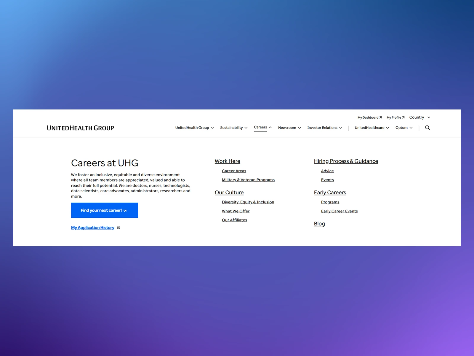
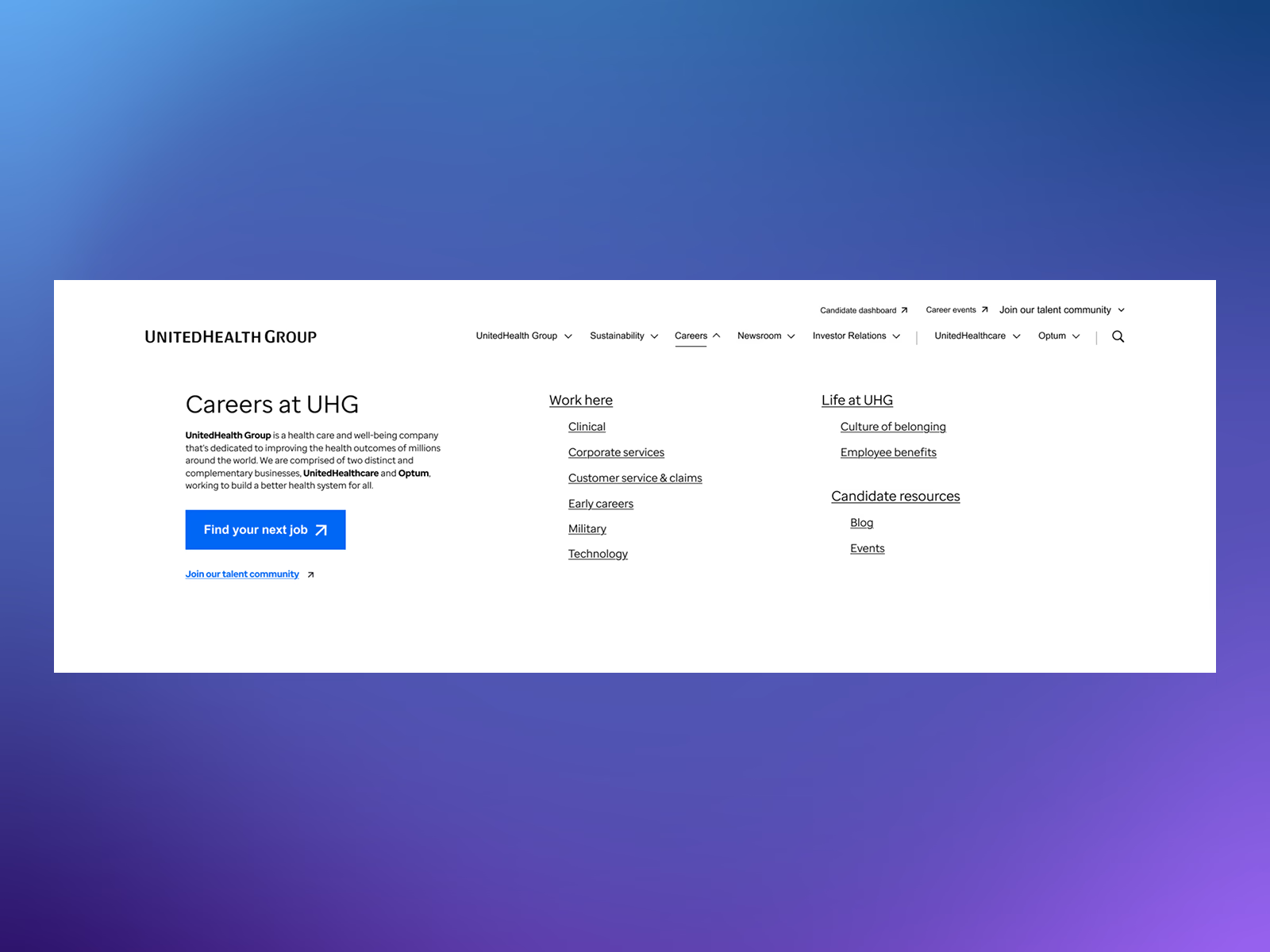
47% → 51%
79% → 84%
2:38 → 2:47
20% → 19%
58% → 63%
43 → 46
"It's easy to apply for jobs."
"The website is easy to navigate."
Most-cited post-launch survey feedback